Unicorn Stores
Amber Sunset
Unicorn Stores (HK) Ltd. was established in 1985 to operate a chain of department stores and supermarkets from Japan in Hong Kong, with a mission to deliver “high-quality, sincere and courteous service of a department store from Japan to customers”.
Bean Buro was tasked with designing their headquarters which has special needs to store and review samples.
Bean Buro team: Lorène Faure, Kenny Kinugasa-Tsui, Christina Standaloft, Isabelle Gin, Savannah Wilkins
Main Contractor / Project Manager: Element Technologies & Supplies Ltd.
Client: Unicorn Stores (HK) Ltd.
“The design utilises various subtle Japanese elements as inspiration for bespoke elements such as acoustic screens, wall art, and a gridded ceiling.”
— Lorène Faure, co-founder of Bean Buro
The Narrative: A modernised courteous workplace
We translated Unicorn Stores’ company ethos as a very general and courteous workplace for the employees. We helped them move from a traditional office setup to a contemporary workplace that is much more sociable for collaborations while being comfortable and soothing.
The design utilises various subtle Japanese elements as inspiration.


The Process: Infusing Japanese roots into the interior
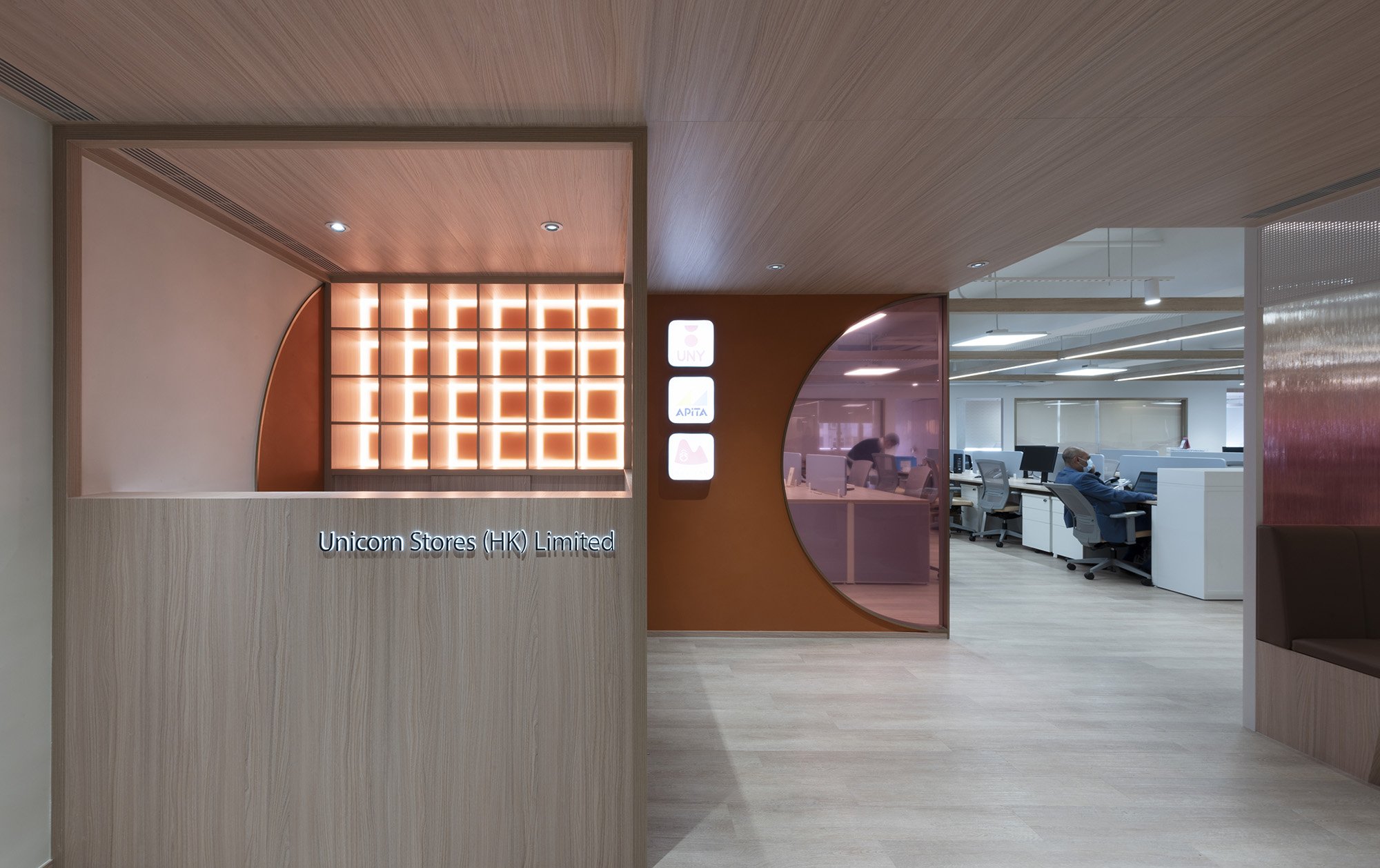
We researched traditional Japanese architecture and translated the ideas into simple timber joinery to create various bespoke elements, such as the reception desk, a gridded ceiling lighting system, and Japanese partition screens. Other Japanese inspirations include the use of a ‘noren’ – traditional dividers made of natural fabric, often hung in doorways and between rooms, and playful Japanese motifs in the graphic design and signages.


The Solution: An open and integrated neighbourhood
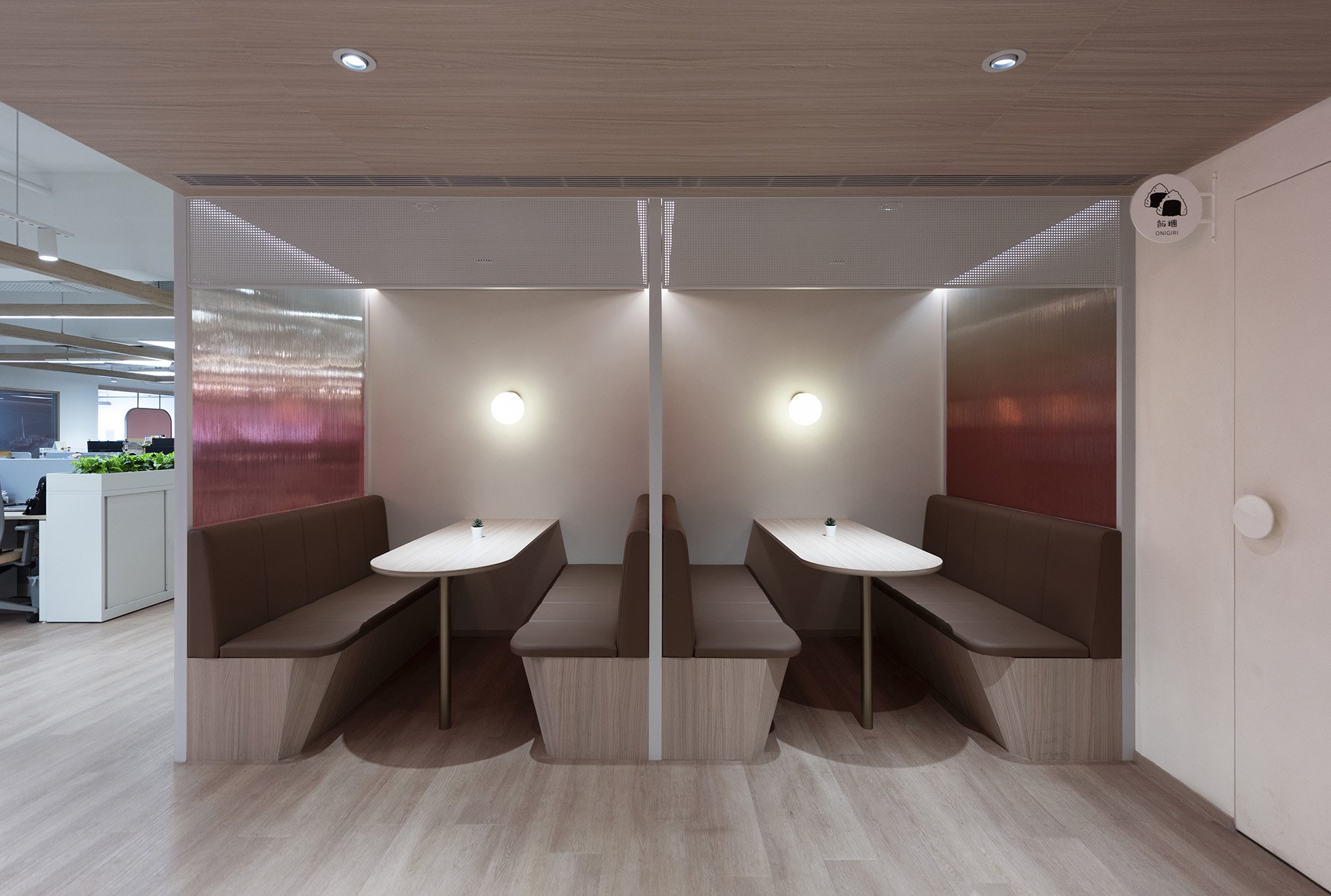
The entrance and reception foyer has been lined in timber to create a warm and welcoming atmosphere with seating booths which can be used by visitors and employees alike in a cosy setting.
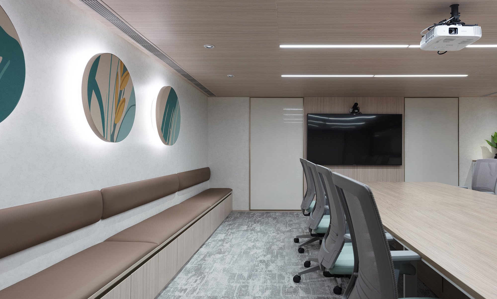
The general workplace is an open plan, one big connecting neighbourhood with various shared furniture integrated. Enclosed meeting rooms are located in the core of the workplace with glass partitions to preserve visible connections and plants are incorporated into all the windowsills.
Rather than enclosed offices for the departmental heads, they are instead connected to the team as part of the open plan while still retaining a level of privacy through the use of a series of bespoke acoustic partition screens with a custom textile design.
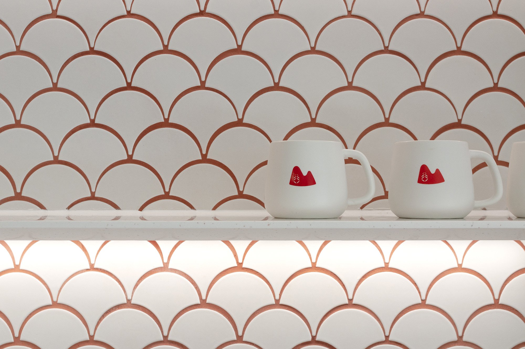
The pantry is an informal space for the employees to relax with flexible café seating. The area also has pegged walls for sharing community information. Roller blinds are used along the pantry windows and help to strengthen the identity of the workplace through custom graphic design.
The Materials: Neutral naturals with playful accents
The palette is predominantly timber and white for the architectural surfaces. Several accents are created in the materials, including the use of a gradient fluted glass for the partitions of the collaboration booths, playful geometry such as arcs and circles in red—an interpretation of the brand—and other subtle uses of colours and graphics on the glass and acoustic partitions. Red coloured grout is also used for the tiles in the pantry area to further inject the brand’s identity into the design.
We located the general work neighbourhood to be near the windows for ample natural daylight, and the meeting rooms in the core with an airy lighting design, to ensure excess artificial lighting is not required. For example, the various wall acoustic panels with backlighting help to improve the legibility of the rear walls of the space.
Carpets have been used in all enclosed meeting rooms and plants have been integrated into the joinery design. We also specified low VOC paint and veneer laminates.


“The key was to strike a delicate balance of creating a very strong company identity through the use of colours, gentry, signages and still ensuring the workplace is a comfortable and soothing work setting.”
— Kenny Kinugasa-Tsui, co-founder of Bean Buro
The Challenge: A delicate balancing act
The challenge in terms of design was striking a delicate balance of creating a very strong company identity through the use of colours, gentry, signages and still ensuring the workplace is a comfortable and soothing work setting. For example, we employed vibrant colours in the front of house reception and the pantry areas to stimulate energy for heightened social interactions but kept all the general workspaces very neutral using natural materials.
The outcome is a workplace that embraces social, collaborative, and flexible working.