Beachside Haven
Repulse Bay Garden
This residential design is for a family of four (parents and two children with a couple of live-in helpers). The brief was to create a space that allows the parents who are in the financial industry to work from home when needed while watching over the kids. The kids would also have a lot of fun at home while doing their studies. This required a creative design with a great deal of flexibility and keeping the mood and feel refined in the adult-used spaces but fun and playful in the children's rooms.
AwardsINDE. Awards 2023 - ‘The Interior Space’ Shortlist | Better Future HONG KONG Design Awards 2023 - 'Gold' Winner | Better Future ASIAN Design Awards 2023 - 'Silver' WinnerBean Buro team: Lorène Faure, Kenny Kinugasa-Tsui, Jamie Yue, Shefield Ng
Client: Private
“Thank you again for designing the wonderful new home for us. We love it! Hotels now can’t compare to home.”
— Private Client
The Narrative: Beach tranquility
We were inspired by the beautiful Repulse Bay Beach, which the apartment overlooks. Through a sophisticated use of beige evocative of sandy beaches throughout our material palette, we put together a calming and soft aesthetic, forming a dialogue with tranquil external scenery for a heightened sense of well-being.
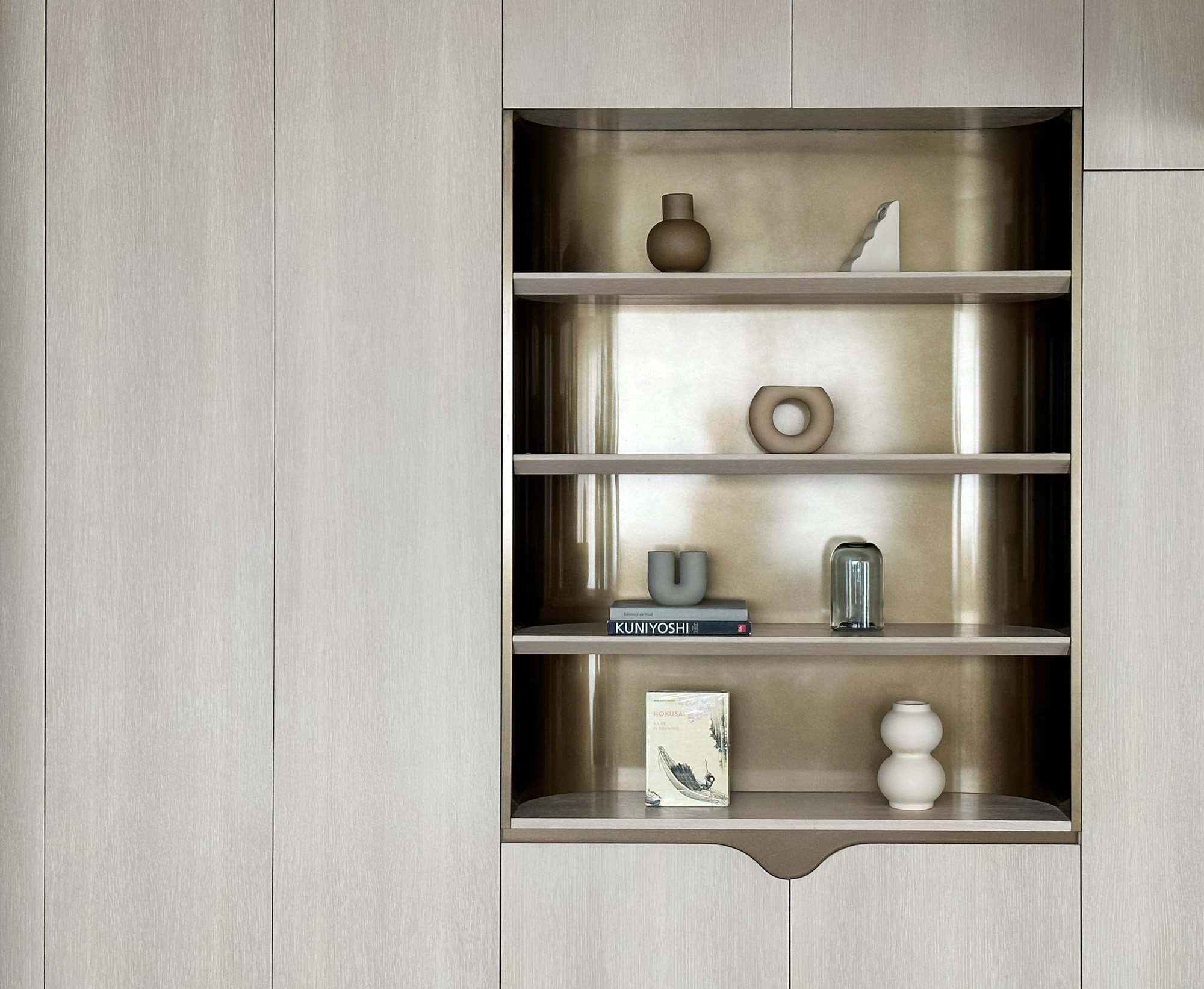
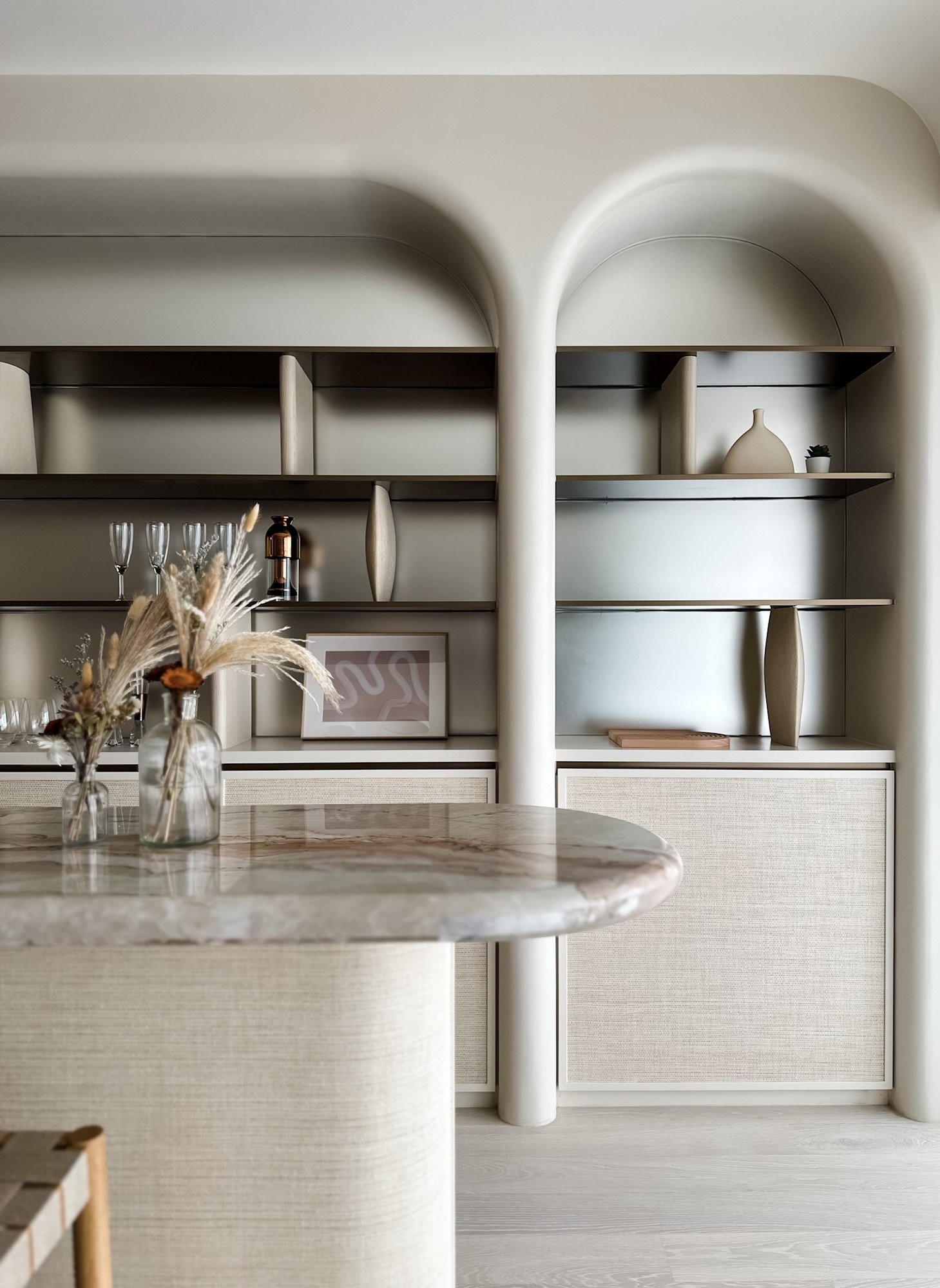
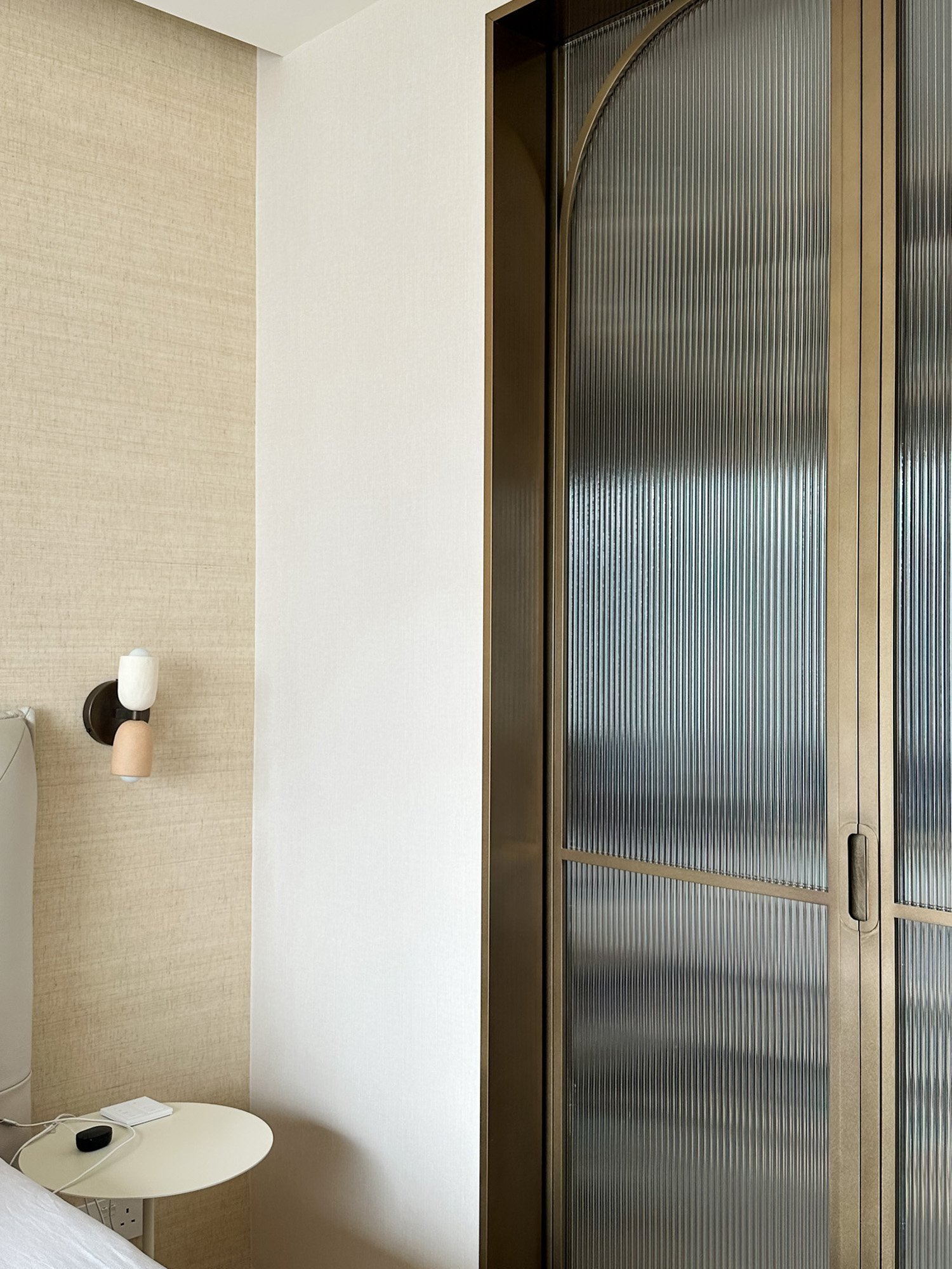
We carefully introduced subtle, curved geometries to explore a sense of softness. We rounded edges to mitigate the contrast between light and shadow. For example, in the open dining and lounge space, we constructed a dry pantry as a backdrop with a set of rounded arches that contain display shelves. To keep each shelf thin, we used bespoke sculptural bookstands in irregular shapes that provide structural support while acting as a decorative element.

The Process: Bespoke curves
We carefully introduced subtle, curved geometries to explore a sense of softness. We rounded edges to mitigate the contrast between light and shadow. For example, in the open dining and lounge space, we constructed a dry pantry as a backdrop with a set of rounded arches that contain display shelves. To keep each shelf thin, we used bespoke sculptural bookstands in irregular shapes that provide structural support while acting as a decorative element.
The back wall surface of the shelf has a reflective finish to add a pristine and airy atmosphere to the lounge. This optically relieves the space and adds a feeling of generosity to the open area.

The Solution: Versatile spaces with a panoramic view
Stepping into the apartment, one can immediately appreciate the view out to the beach in a large open space composed of the dry pantry, dining area and lounge. The spatial strategy creates a panoramic effect with the windows and balcony, allowing maximum daylight to permeate the apartment. Bespoke porous screens with a friendly aesthetic are positioned between the dining area and the lounge to form subtle partitioning while bringing a unique personality.


“We carefully introduced subtle, curved geometries in our bespoke joinery to explore a sense of softness to complement the apartment’s soothing beach view.”
— Lorène Faure, co-founder of Bean Buro
The backdrop is a timber volume which houses an enclosed home office with glass windows to bring in natural daylight since this is a supplementary room created in the centre of the apartment without any immediately accessible windows. This is an additional study room to the existing study next to the children's bedrooms and master ensuite.
The children's quarters have been designed with flexibility in mind to adapt to the family's growing needs. While the young children can share a bedroom for now, the playroom includes a tuck-away murphy bed should it become another bedroom when the kids wish to have individual rooms.

The Materials: Neutral with pops of playfulness
To achieve the beach-inspired mood and feel, we worked with whitewashed timber for the general flooring and surfaces and various shades of beige and off-white paint colours for some walls and joinery. We also incorporated an earthy red fabric in multiple areas to bring warmth and depth to the colour scheme.
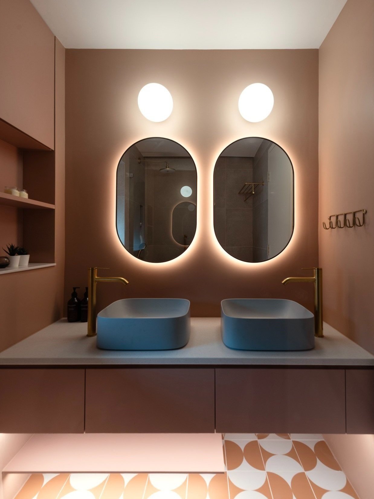
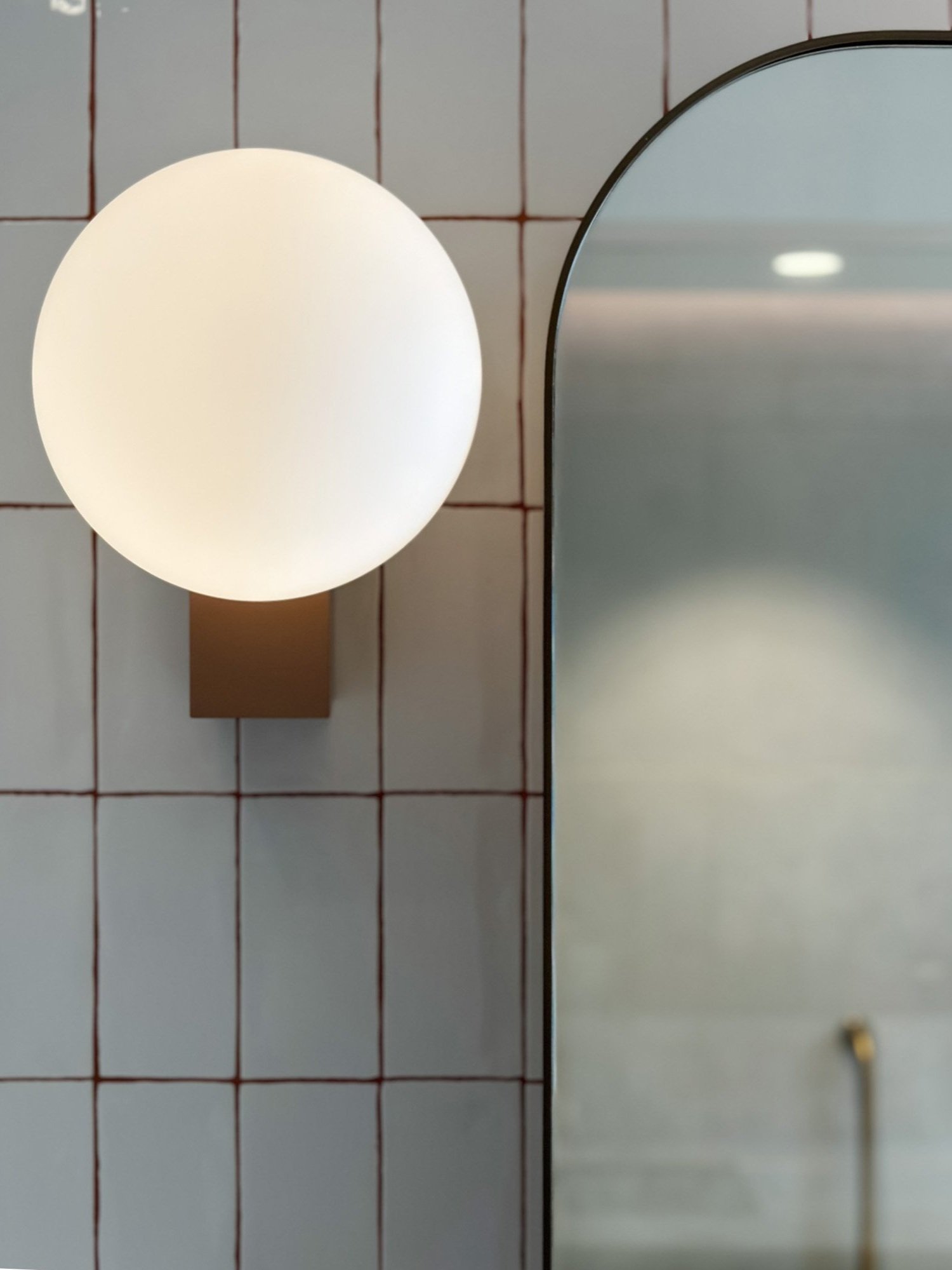
For the master bathroom, we applied red-coloured grouting between white tiles to add a sense of playfulness to the more mature setting. On the other hand, colour is used more liberally in the kids' bathroom with muted red walls and terracotta-coloured patterned tile flooring.
Well-being: Sustainable and child-friendly
Wherever possible, we used sustainable materials in the design. For example, the specified timber flooring is manufactured from renewable raw materials and can be recycled later. Wood also naturally stores carbon dioxide, even after it is transformed into flooring. Furthermore, we ensured to select materials from brands that exercise responsible sourcing and reduce waste in the manufacturing process, thereby having a low environmental impact. The paint we used is also kid-friendly with low VOC levels.